Cross Platform
Ionic is built from the ground up to make development easy, no matter what platform you are building for. Ionic apps are truly cross-platform: able to run as an Android, iOS, Electron, and Progressive Web App (PWA), all from a single codebase. There are some points to keep in mind when optimizing an app to work across these platforms.
In a native application, it's common to make API calls to communicate with the device, such as opening the camera or accessing geolocation. These API calls won’t work when called in a web environment because there’s no native bridge. There are a few ways Ionic handles this.
Ionic Native has its own internal logic to detect if it is inside of a native environment. Instead of throwing a runtime error, it will print a warning if it is not a native environment and there are no Cordova plugins available. The app won’t break and it will continue to work, although without the native functionality.
In an app’s logic, whenever it is needed to make a native API call, it is recommended to always check the status of the native environment first. For example:
this.platform.ready().then(() => {
if (this.platform.is('hybrid')) {
} else {
}
});
This bit of code can be incredibly helpful when targeting environments where access to the native APIs is uncertain.
Many native APIs that people use (for example, the File API), are not available in the browser. The APIs are always improving and catching up to native, so it is recommended to research them. Taking the first two points into consideration, it's fairly easy to create a nice experience that will adapt for the platform the app is running on.
When planning to deploy an app to desktop, either using Electron or as a Progressive Web App, it is important to ensure the app works smoothly on larger devices.
Many people rarely notice the layout of an app, but it can have a massive impact on experience and usability. Consider this common UI pattern:
<ion-content>
  <ion-item>
    <ion-label>Item 1</ion-label>
  </ion-item>
  <ion-item>
    <ion-label>Item 2</ion-label>
  </ion-item>
  <ion-item>
    <ion-label>Item 3</ion-label>
  </ion-item>
  <ion-item>
    <ion-label>Item 4</ion-label>
  </ion-item>
  <ion-item>
    <ion-label>Item 5</ion-label>
  </ion-item>
</ion-content>
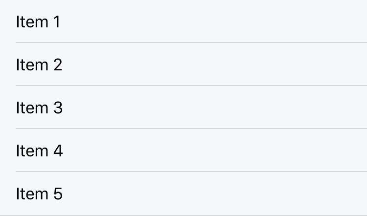
This will render 5 items with a width of 100% each. This may look great on a mobile device, as seen below, but viewing this on a desktop browser is a different story. The items become stretched to fill the entire screen because of the wide screen width, leaving screen space unused.

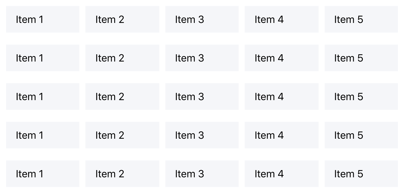
To improve this experience, we can wrap the items in a Grid component. The view can be easily rewritten into something more usable on larger screens:
<ion-grid>
  <ion-row>
    <ion-col>
      <ion-item>
        <ion-label>Item 1</ion-label>
      </ion-item>
    </ion-col>
    <ion-col>
      <ion-item>
        <ion-label>Item 2</ion-label>
      </ion-item>
    </ion-col>
    <ion-col>
      <ion-item>
        <ion-label>Item 3</ion-label>
      </ion-item>
    </ion-col>
    <ion-col>
      <ion-item>
        <ion-label>Item 4</ion-label>
      </ion-item>
    </ion-col>
    <ion-col>
      <ion-item>
        <ion-label>Item 5</ion-label>
      </ion-item>
    </ion-col>
  </ion-row>
</ion-grid>
By wrapping the items in an ion-grid element, the Ionic grid system is added to our layout. Wrapping each item in a column makes the items take up equal-width inside of the grid, along the same row.

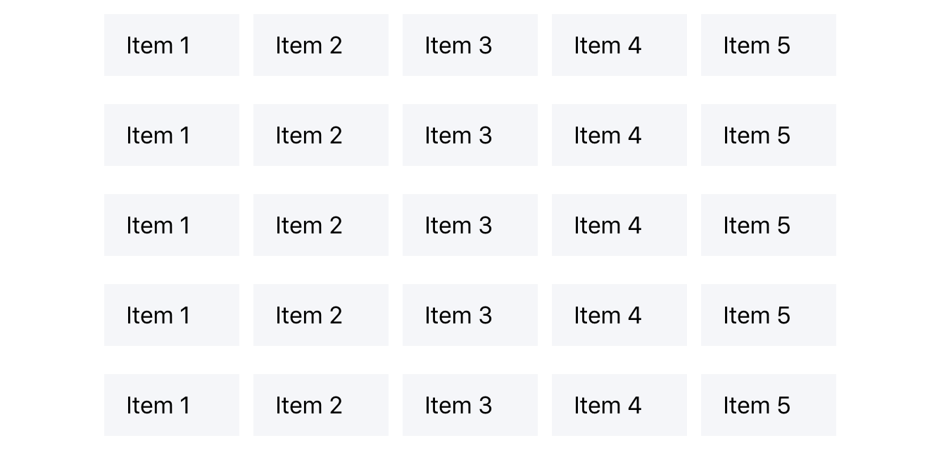
We can take this even further by adding the fixed attribute to the <ion-grid> element. This tells the grid to have a fixed width based on the screen size. This is perfect for larger screens when items will begin to stretch again without a width on the grid.

The grid can be further customized to change the sizes of columns with the addition of the ion-col properties.
<ion-grid fixed>
  <ion-row>
    <ion-col size="12" size-sm="9" size-md="6" size-lg="4" size-xl="3">
      <ion-item>
        <ion-label>Item 1</ion-label>
      </ion-item>
    </ion-col>
    <ion-col size="12" size-sm="9" size-md="6" size-lg="4" size-xl="3">
      <ion-item>
        <ion-label>Item 2</ion-label>
      </ion-item>
    </ion-col>
    <ion-col size="12" size-sm="9" size-md="6" size-lg="4" size-xl="3">
      <ion-item>
        <ion-label>Item 3</ion-label>
      </ion-item>
    </ion-col>
    <ion-col size="12" size-sm="9" size-md="6" size-lg="4" size-xl="3">
      <ion-item>
        <ion-label>Item 4</ion-label>
      </ion-item>
    </ion-col>
    <ion-col size="12" size-sm="9" size-md="6" size-lg="4" size-xl="3">
      <ion-item>
        <ion-label>Item 5</ion-label>
      </ion-item>
    </ion-col>
  </ion-row>
</ion-grid>
There’s a lot going on in the example above. These are the key points:
The ion-col gets its width from the size attribute added to it, where the value of size is the number of columns to take up out of the total available columns. The default number of available columns is 12.
The size attribute can have a breakpoint added to it, size-{breakpoint}. This value sets the size for the specified breakpoint and above.
For more information on customizing with grid, see the Grid documentation.
Most apps at some point will need to store some sort of data locally. Whether it’s storing some JSON from an XHR request, or saving an auth token, there are many different storage options available. On top of this, if the app is running in a native environment, it is possible to create a full SQLite database and store data there. All of these different storage mechanisms have their own advantages and disadvantages, but Ionic developers should not have to worry about that.
In this case, Ionic’s Storage library is a perfect candidate for the multi-environment use case. Built on top of the well tested LocalForage library, Ionic’s storage class provides an adaptable storage mechanism that will pick the best storage solution for the current run time.
Currently this means it will run through SQLite for native, IndexedDB (if available), WebSql, or Local Storage. By handling all of this, it allows writing to storage using a stable API.
class MyClass {
  constructor(public storage: Storage) {}

  async setData(key, value) {
    const res = await this.storage.set(key, value);
    console.log(res);
  }

  async getData(key) {
    const keyVal = await this.storage.get(key);
    console.log('Key is', keyVal);
  }
}
There are other storage solutions out there as well, such as PouchDB, which provide a similar, adaptable storage mechanism.